Mighty-good refresh.
Did someone say blue plate special?
This beloved local diner has been given a bold new identity, a modernized menu, and a fresh perspective—while preserving the same great quality that made it a staple in the community. With its extremely passionate owners, the restaurant continues to serve up comfort food with a contemporary twist, welcoming both loyal customers and new faces to experience the next chapter of this local favourite.
PROJECT TYPE
Brand identity, Advertising
PROJECT YEAR
2024
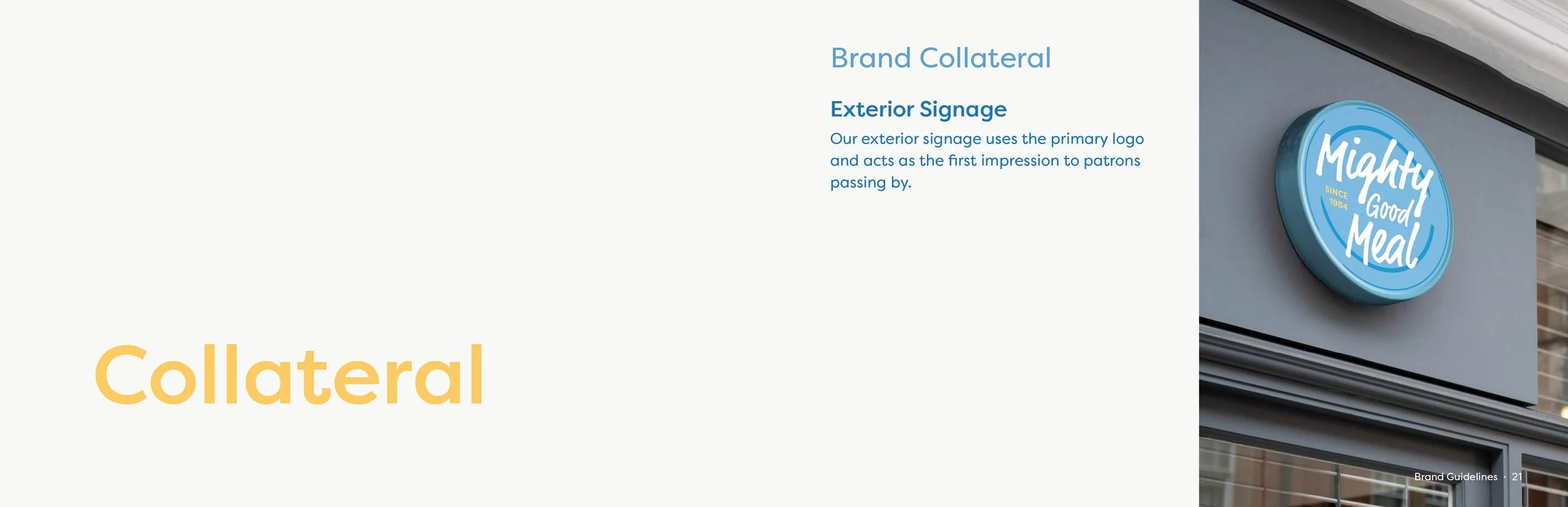
THE TASK
MGM Restaurant has been a Nanaimo staple since 1984, and until now, its logo had never changed. It was time for a fresh look —from a new logo to updated uniforms, takeout packaging, and advertisements, covering all the key touchpoints they were missing. The goal? To attract more foot traffic and bring in a wave of new customers during the busy summer months.
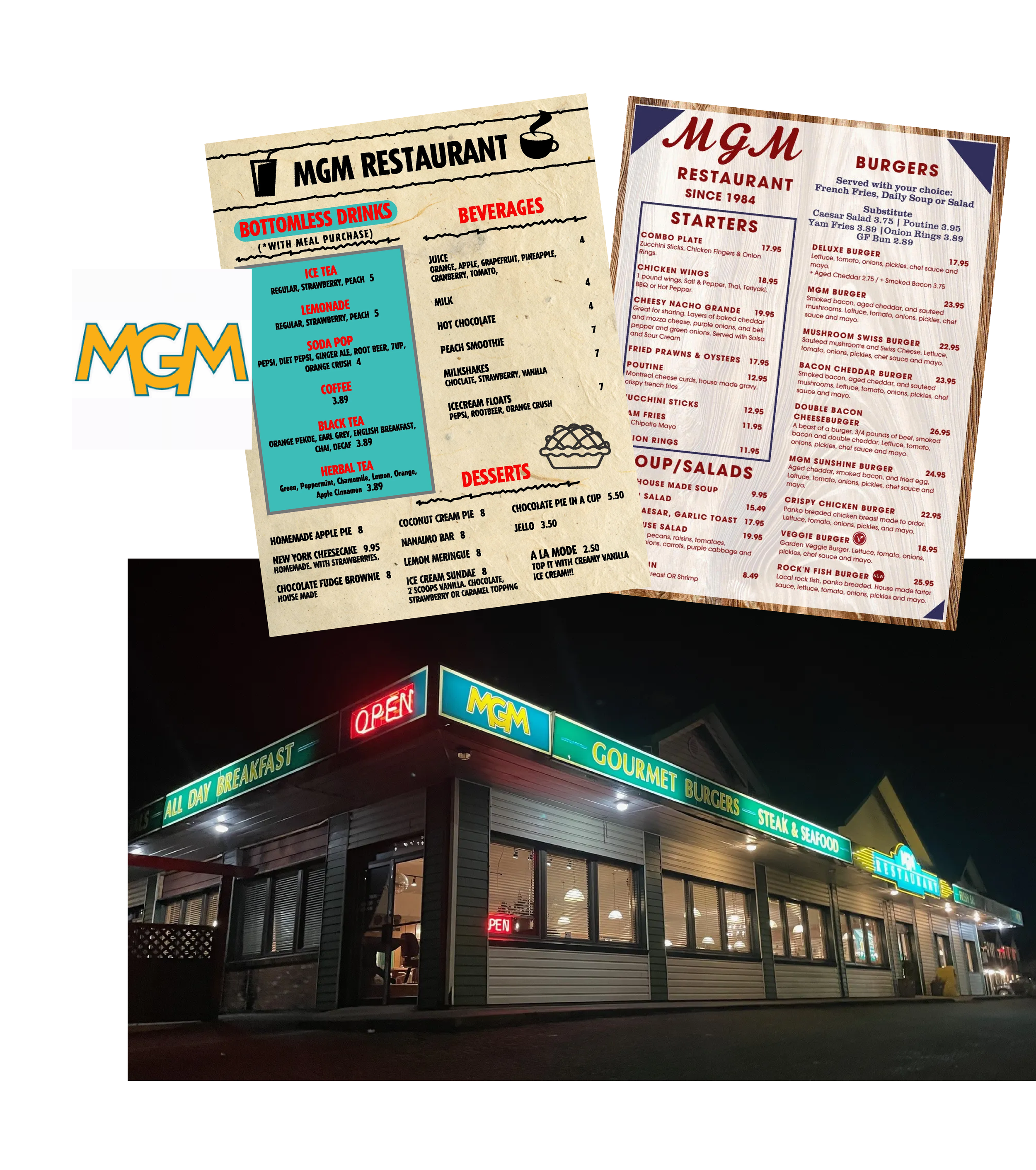
Current menus, signage and logo
THE CHALLENGE
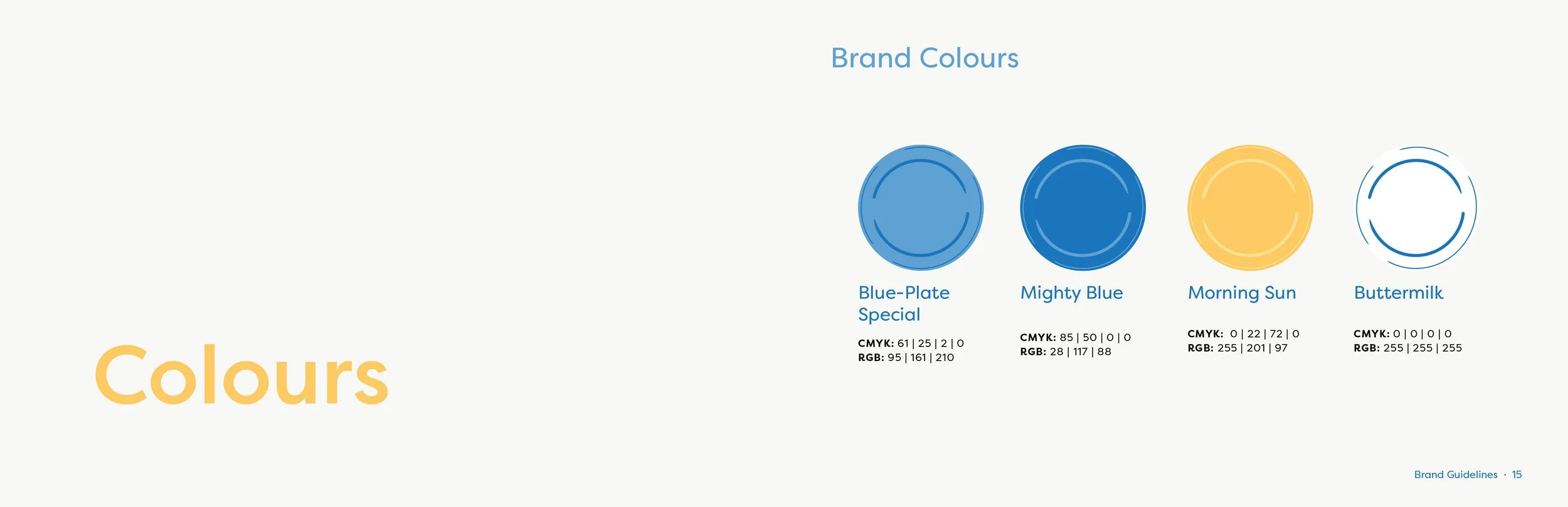
One of the biggest challenges was selecting a new color palette—rebranding a well-loved local spot meant walking a fine line between refreshing the look and staying recognizable. Replacing the retro green and yellow palette meant carefully selecting new colors that felt modern without losing the diner’s charm.
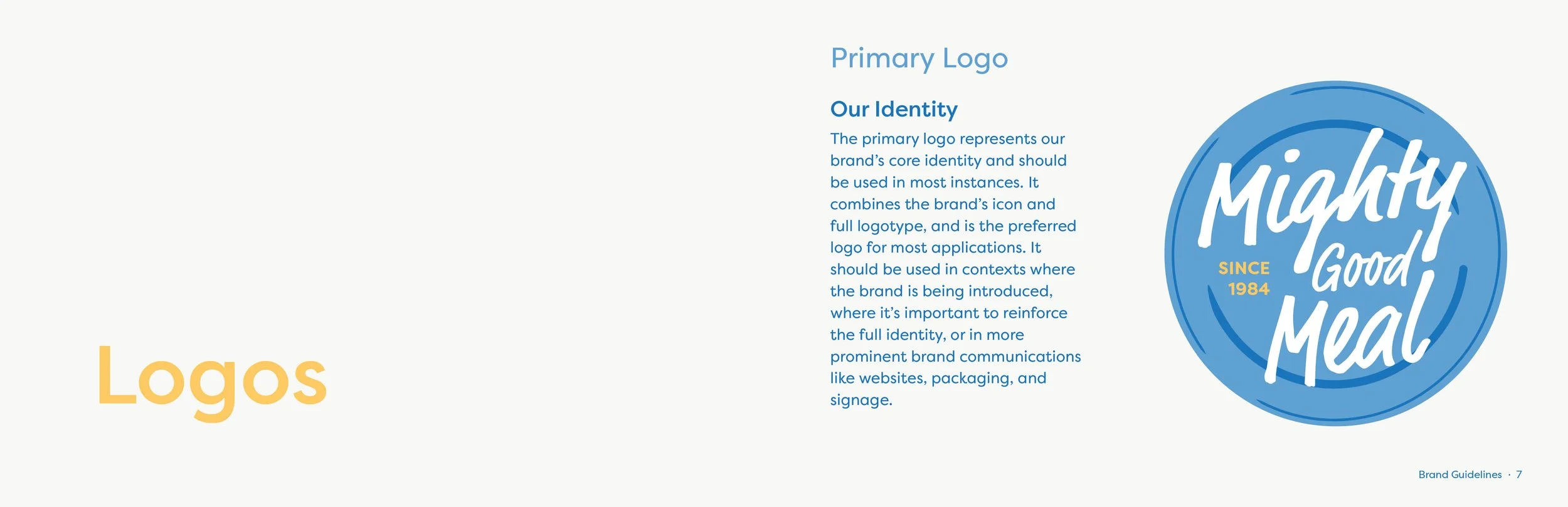
After an extensive set of logo iterations, and discovering MGM was actually short for Mighty Good Meal, it was decided the name would be expanded with the new branding.

Some (of very, very many) logo iterations, with the final draft
THE SOLUTION
The chosen logo had a signature blue plate that could be used across various touchpoints, including menu items served on actual blue plates as a nod to the classic "blue plate special." From there, the brand colors fit well and created a modern look beside the hand-illustrated graphics.
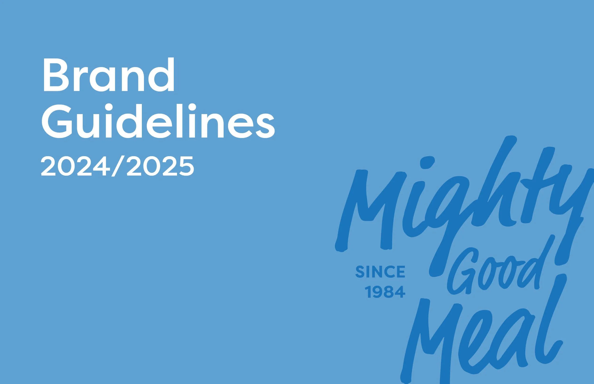
See below: The official brand guidelines, designed for an 8.5" x 5.5" printed booklet.


The final logo on a signature blue plate!


A 3-page advertising campaign to announce the re-opening